Your e-commerce website’s UI design is your first impression and often your only chance to capture a visitor’s attention. Imagine walking into a store where products are disorganized, checkout counters are cluttered, and signs are difficult to read. You’d walk right out, wouldn’t you?
That’s exactly what happens online when your UI isn’t up to par. Studies show that 75% of consumers judge a site’s credibility based on its design. Combine that with a cluttered layout, poor navigation, or clunky mobile experience, and your bounce rate skyrockets.
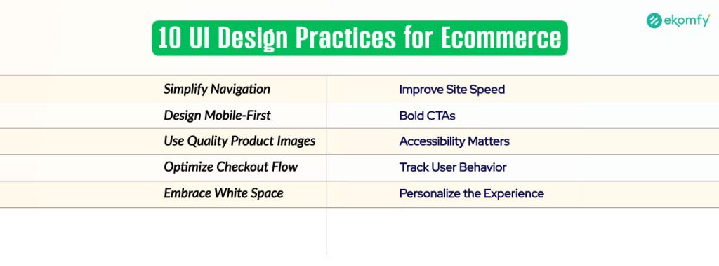
If you want more clicks, better engagement, and sky-high conversions, you need to master the 10 best UI design practices for your e-commerce website.
Role of UI/UX in ECommerce Success
UI, or User Interface, encompasses everything your customers see and interact with, including buttons, menus, colors, and layout. UX, or User Experience, focuses on how users feel while navigating your site. It might be smooth and easy or frustrating and clunky. Together, UI and UX create the digital shopping experience.
The key difference between UI and UX is that UI focuses on the visual appearance and user experience, while UX emphasizes the overall user experience. UI is like the storefront, and UX is the shopping journey inside. A slick UI grabs attention, but if the UX isn’t seamless, customers won’t stay to complete a purchase.
Good UI doesn’t just make things pretty. It enhances usability, fosters trust, and encourages users to take action. That’s how it directly impacts engagement, sales, and long-term customer loyalty.
Simplify Navigation for Effortless Browsing
Getting lost on a website is frustrating. That’s why your e-commerce site needs clear and simple navigation. Think of your navigation bar as a GPS. If it’s cluttered or confusing, visitors will give up before they even find what they need.
Start by limiting your main menu to only essential categories. A menu with too many options overwhelms users. Use breadcrumb trails so shoppers always know where they are and how to get back. Also, ensure that your search bar is easily visible and provides accurate results.
Your homepage should highlight top categories and bestsellers, giving users immediate direction. When customers can find what they’re looking for quickly, they tend to stay longer and make more purchases.
Design Mobile-First for Seamless User Experience
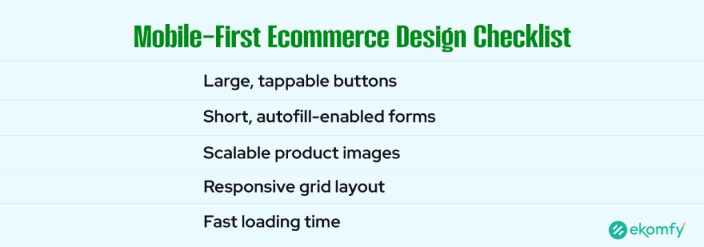
With over 72% of e-commerce traffic now coming from mobile devices, designing for mobile users is no longer optional. If your site isn’t mobile-friendly, users will likely leave and probably never return.
To create a great mobile UI, start with large, tappable buttons so users don’t accidentally press the wrong option. Keep forms concise and ensure they support autofill and single-step logins to expedite the checkout process. Your images and layout must scale beautifully across all screen sizes, from phones to tablets.
In 2025, mobile-first design isn’t just about aesthetics. It’s about functionality and speed. Google even prioritizes mobile-optimized sites in search rankings, giving you another reason to put mobile users first.
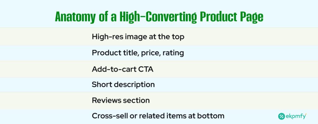
Use High-Quality Product Images and Visual Hierarchy
Shoppers can’t touch or try your products online. They rely entirely on what they see. That’s why product images and layout hierarchy are critical.
Your product photos must be high-resolution and allow users to zoom in for a clear view. Include images from multiple angles, as well as lifestyle shots that show the product in use. This builds trust and helps customers imagine owning the item.
Visual hierarchy means organizing content in a way that draws attention to the most critical parts first. Ensure that product titles, prices, and reviews are prominently displayed. Place your ‘Add to Cart’ button near the top so users don’t have to scroll.
When your layout tells a visual story, shoppers are more likely to stay, explore, and make a purchase.
Optimize Your Checkout Page to Minimize Abandonment
A complicated checkout process is the number one reason for cart abandonment. With an average abandonment rate of 70%, that’s a lot of lost revenue. Your UI needs to make buying feel fast and easy.
Use a single-page checkout if possible. The fewer steps between adding to the cart and completing the purchase, the better. Let users check out as guests without requiring an account. Show shipping costs, delivery times, and return policies upfront, so there are no surprises.
Adding trust badges and secure payment icons helps reassure customers at the final moment. A precise, well-designed checkout flow can turn browsers into buyers.
Leverage White Space for a Clean, Modern Look
White space, also known as negative space, isn’t wasted space. It’s a powerful tool in design. When used correctly, it helps your content breathe, creates balance, and improves readability.
Surrounding key elements, such as headlines, call-to-action buttons, and product photos, with white space draws attention to them. It makes your layout feel open and organized, not cramped or chaotic.
Avoid clutter by limiting the use of sidebars and pop-ups. Stick to one central message per screen. When everything has room to breathe, your site feels more polished and professional.
Minimalist design doesn’t mean boring; it means focused. And focus leads to conversions.
Speed Up Your Website with Smart UI Choices
Speed kills, but in e-commerce, it’s the lack of speed that can destroy your business. If your site takes more than three seconds to load, over half of your visitors will leave.
Many design elements can slow down your site. Large images, animations, and unoptimized code are common culprits. To speed things up, compress all images and use modern formats like WebP. Lazy loading ensures images only load when users scroll down to them, improving initial page speed.
Stick to clean UI frameworks that don’t bloat your site with unnecessary features. When your store feels fast and smooth, users stay longer and make more purchases.
Create Clear and Bold Calls-to-Action (CTAs)
Calls to action are the most important elements on your product pages. They guide your users to take the next step, whether it’s “Add to Cart,” “Buy Now,” or “Sign Up.”
Your CTA buttons need to stand out. Use bold, contrasting colors that grab attention. Make the text short, clear, and action-oriented. Don’t use vague language like “Click Here.” Tell users exactly what they’re doing.
Position your CTA above the fold so users don’t have to scroll to find it. Additionally, consider repeating it near the product description or after reviews to catch users who need a second nudge.
Always test different versions to find what works best. Even small changes in button color or wording can lead to significant improvements in conversion rates.
Design With Accessibility in Mind
Designing for accessibility means making your e-commerce store accessible to everyone, including individuals with disabilities. It’s not just the right thing to do; it’s also a smart business move.
Use high-contrast colors and large, readable fonts so that all users can easily read your content. Every image should have descriptive alt text, which is also great for SEO. Ensure your site is accessible to users with disabilities, including those who use keyboard navigation and screen readers.
Avoid design choices that may trigger seizures or disorientation, such as flashing animations or moving backgrounds. When your site is easy to use for all people, you expand your reach and build a more inclusive brand.
Use Behavioral Analytics to Improve UI Continuously
You can’t improve what you don’t measure. That’s why behavioral analytics is essential for e-commerce UI UX design. Tools like heatmaps and session recordings let you see exactly how users interact with your site.
By tracking user behavior, you can identify where people drop off, which buttons they ignore, and which pages keep them engaged. Maybe users aren’t scrolling far enough to see your CTA. Or perhaps they’re clicking on images that aren’t linked.
Use this data to make informed design changes. A few minor tweaks, backed by real insights, can lead to significant improvements in user experience and sales.
Personalize the UI to Match User Intent
Today’s shoppers expect personalized experiences. Your e-commerce UI should adapt based on the user’s identity and their current activity.
For example, you can display recently viewed products on the homepage or suggest items that are frequently bought together. Use cookies and browsing data to autofill forms and offer innovative search suggestions.
When your site feels custom-built for each visitor, they’re more likely to engage. Personalized UI shortens the buying journey and increases customer satisfaction.
Emerging UI Design Trends for ECommerce in 2025
The world of design is constantly evolving. To stay ahead of the competition, keep your e-commerce UI fresh and innovative. Trends like glassmorphism and soft shadows are gaining popularity for their sleek, layered appearance.
Microinteractions incorporate subtle animations that make buttons and menus appear more engaging. They enhance user feedback and make your site more fun to explore. AI-powered UI tools are also on the rise, adjusting layouts in real-time based on user behavior. By staying on top of trends, your store stays modern, relevant, and exciting.
Craft a UI That Converts, Not Just Impresses
Great UI design isn’t about flashy graphics or fancy effects. It’s about creating a shopping experience that’s simple, smooth, and effective. If your e-commerce store is difficult to navigate, slow to load, or cluttered with distractions, customers will likely leave.
However, when your UI is clear, focused, and user-friendly, it builds trust and makes the buying process feel effortless. Apply these 10 UI design practices, and you’ll turn more visitors into happy customers. Don’t just aim to impress, design to convert.
Do you have questions or need expert help with your e-commerce UI/UX? Contact Ekomfy today and let’s build a store your customers will love to shop in!
FAQs
What makes a good e-commerce UI design?
A good e-commerce UI is clear, fast, mobile-friendly, visually appealing, and guides users smoothly from browsing to checkout with minimal effort.
How does UI design affect my online store’s conversion rate?
A great UI reduces confusion and friction during the shopping process. This builds trust and makes it easier for users to complete purchases, which increases your sales.
Should I hire a UI/UX designer for my e-commerce store?
Yes. A professional designer brings the expertise needed to optimize layouts, improve usability, and create a more engaging experience that drives conversions.
What tools are best for e-commerce UI design?
Popular tools include Figma, Adobe XD, Sketch, Webflow, and InVision. These platforms allow you to design, prototype, and test interfaces effectively.
How often should I update my e-commerce UI?
You should review and update your UI at least once a year, or whenever performance data indicates a decline in engagement. Regular A/B testing helps fine-tune ongoing improvements.